Bachelor Thesis in the Bachelor of Science in Computer Science with specialisation in Design and Management at FHNW
Guiding Maps is an interactive web application that helps older adults find their ideal living arrangement while clearly understanding all associated housing, care, and nursing costs. Through an intuitive map visualisation, users can explore housing offers alongside important surrounding amenities such as grocery stores, medical facilities, and green spaces. An integrated supplementary benefits calculator automatically checks eligibility for each offer. The result is a clear, simple, and transparent presentation of otherwise complex information.
The design process followed a strictly user-centred approach. It began with extensive research into the needs of older adults, covering both internal factors (cost, accessibility, comfort, noise levels) and external factors (public transport, healthcare, parks). Based on this, three representative personas and customer journey maps were developed to define scenarios and requirements precisely. Since the target audience’s technical familiarity varies widely, simplicity of interaction was a key design principle.
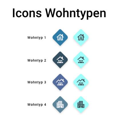
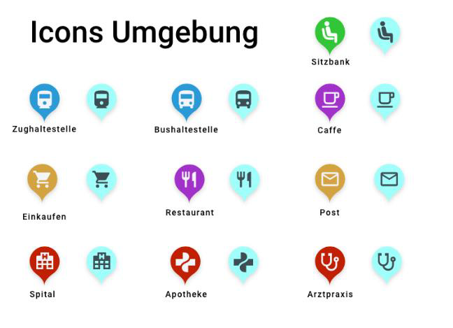
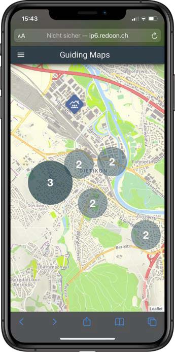
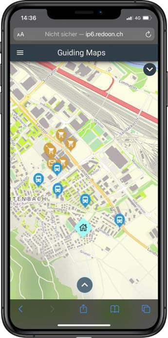
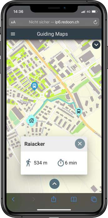
The information architecture and interaction design were crafted to ensure that users encounter familiar patterns and can navigate intuitively. Housing offers are displayed as markers or clusters depending on zoom level. Surrounding amenities can be toggled on and off, with colour coding and icons for clarity. This keeps the map clean and avoids information overload. Only decision-critical data is shown, ensuring focus without sacrificing necessary detail.
During prototyping, low- and high-fidelity versions were tested with the target group in usability lab sessions. A/B tests determined the most effective icon shapes, colour contrasts, and marker sizes. The final design uses a calm palette of blues as the base, with distinct accent colours for different categories. The Roboto typeface, in larger sizes than typical applications, ensures readability.
Building the technical foundation required balancing user needs with system performance. I chose Vue.js with Vuetify for the frontend to ensure component consistency and accessibility compliance.
The backend architecture centers on Laravel for its robust handling of complex data relationships—crucial when managing housing costs, eligibility criteria, and geographic boundaries. MySQL proved ideal for storing and querying the intricate web of housing and cost data that drives the application’s recommendations.
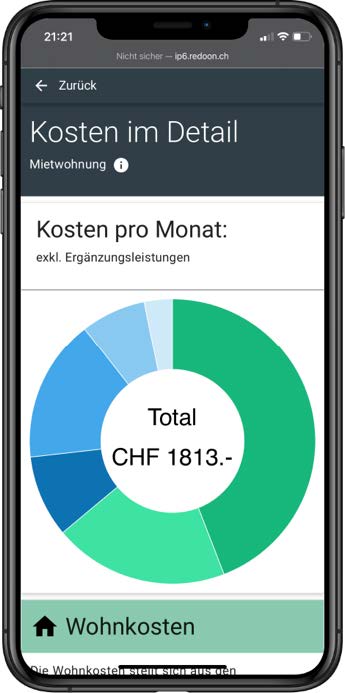
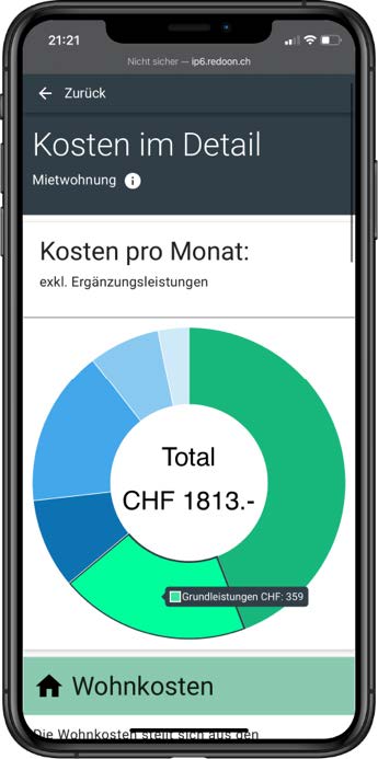
For the mapping experience, I integrated Leaflet with the Mapbox API to achieve smooth interactions without sacrificing loading speed. Chart.js handles the cost visualisations, particularly the donut charts that break down monthly expenses. The real challenge was weaving together data from OpenStreetMap, the Swiss Federal Office for the Environment, and various cantonal GIS datasets into a cohesive, real-time experience.
A key feature is the cost visualisation: a donut chart displays total monthly costs, split into housing and care expenses. Clicking on any segment reveals further details. The supplementary benefits calculator is intentionally simple, requiring only minimal inputs to deliver a result.
Guiding Maps is the result of combining user-friendly design, visual clarity, and robust technical engineering. It enables older adults to navigate the diversity of housing options with confidence and to understand the full financial picture — all within an accessible, barrier-free interface that makes complex decisions easier.